LightStory: Daniel Rozmiarek Photography
  • Home
  • Happy Faces
  • Blog
  • Meet the Artist
  • Concierge
  • Services

St. Andrew by the Bay: Fine Art or Documentary?

10/11/2014

6 Comments

 
PictureEighth Station: Jesus meets the women of Jerusalem
This weekend, I return to my ongoing project of creating a coffee table photography book to document every Roman Catholic Church in the Archdiocese of Baltimore. Today, I share my work from St. Andrew by the Bay in Annapolis, MD. 
This project presents me with a challenge of balancing competing priorities.  I want the photos to be beautiful decoration, creative art, representative documents, and religiously faithful.  Most important is the balance between fine art and documentary photography.  I want this book to serve as a reference for the Archdiocese of Baltimore, which is the oldest in the United Sates.  Such a reference does not exist.  I want to document the status of the Catholic Church in the United States early in the 21st century. I envision a reference that would be valued by churches as well as secular libraries.  But, I also need the photographs to be beautiful and artistically creative.  Achieving this balance means that I need to makes a few concessions at both ends.  The images can be neither overly religious nor completely secular.  
For example, notice image #2 below of the bench.  I would guess that most non-religious people would see this as a row of park benches.  However, member of this parish, and possibly a few other Catholics, would recognize these benches as pew for an outdoor chapel. And, if they look closely, they will see the stones between the pews that mark the Stations of the Cross, a common feature in Catholic churches.
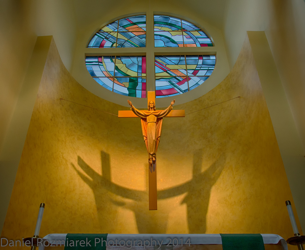
At the other extreme is the photo above, which is a close up of the Eighth Station: Jesus meets the women of Jerusalem.  Catholics will immediately recognize this iconic feature.  However, I created this photograph with artistic elements to appeal to a broad audience.  I created a steep angle of view from below, as if a child was looking up.  Most adults (taller than 5 ft) would not regularly see from this angle. I also reduced the color saturation and enhanced the sharpness to allow the viewer to attend to the details of wood-carving marks on the statues.  I also adjusted the light to emphasize the shadows created on the wall.  I find it appealing to notice the difference in textures between the wood and the shadows.  These artistic elements would apply to a photograph of any sculpture and are not specific to Catholicism.
A few of the images below represent another balance between art, documentation, and faith.  For the interior shots, I applied a treatment of high-dynamic-range (HDR), which is common practice in current real estate photography.  This treatment eliminates most of the interior shadows and enhances the colors of all of the elements in the photograph. So, I created beautiful images that capture the architectural qualities, but I also included specific elements of a Catholic church, such as the altar, crucifix, and apse in image #4 below. Image #6 below is especially representative of my own artistic preference for balance and symmetry in showing the aisle leading out to the narthex.  This view is well-known by Catholics, and welcomed with anticipation after a particularly uninspiring homily.  
I also chose to capture images with people included. Doing so creates an artistic challenge because I can't have the people recognizable without getting a signed photo release form.  I had a cute shot of a little girl by the outdoor altar but I chose this one of the curly-haired boy because you can't see his face.  The black and white image of the outdoor altar shows the activity of parents delivering their children for morning preschool, but their faces are sufficiently obscured.  I also chose this subdued color treatment, as well as black and white for the baptistery, as a way to add visual variation to this set of images.  As a group, I don't want them to appear too similar to each other.  
So, I hope I have achieved my intended balance of decoration, art, documentation, and faith.  And, I would like to give special thanks to Marie, who opened the church for me and turned on the lights.

6 Comments

Monarch Butterfly and Canada Thistle

9/26/2014

6 Comments

 
Picturea monarch butterfly eating thistle
I found this monarch butterfly in a patch of thistle at the Greenbury Point Nature Center near Annapolis.  

At the most basic level, I enjoy this photograph because the pink, green, and yellow colors are pretty to look at.  The butterfly itself is clearly visible, but not immediately obvious, which adds a bit of interest.  I also enjoy looking at the complex texture of the thousands of spines on the thistle leaves.  I also framed and cropped this image to reveal a tall, narrow curve of the shape of the thistle flowers with the butterfly placed at the peak of the curve.  This line serves to encourage the viewer to continue scanning up and down the image.  

But, I also like this photograph because I just spent the past hour learning about monarch butterflies and thistle.  I learned about the Mullerian mimicry between the monarch and the viceroy, and how it used to be believed to be a case of Batesian mimicry. That's what I learned as a kid, although I didn't know the term.  I also learned that milkweed is the preferred food for the monarch, but it will eat thistle, too.  The monarch population is declining rapidly, due in part to the decline of the milkweed population from herbicides.  One study estimated a 90% decline in monarchs since 1996.  And, I learned that thistle is classified as a noxious weed by the Maryland department of agriculture, and that various varieties of thistle are classified as pests by at least 35 states.  I think this photograph shows Canada thistle. If I'm wrong, then it's most likely Bull thistle.  Canada thistle is not native to Canada, or anywhere else in North America.  It is native to the Mediterranean region and is believed to have been carried to North America by European colonists during the 1600s.  

6 Comments

Screech Owl: documentary v. art photography

9/22/2014

7 Comments

 
Picturea close-up view of a screech owl during molting
This owl gives me the opportunity to describe the difference between documentary photography and fine art photography--at least as I understand it.

I create nearly all of my images for the purpose of producing fine art photography, and with the intent to sell them.  Fine art photography is my opportunity to express my artistic impression and often to evoke an emotional response from the viewer.  This technique is contrasted with documentary photography, which is intended to present to the viewer an objective re-creation of the original event, or object.  Photojournalism and medical imaging are examples of documentary photography.

I intend to print and frame this image of this screech owl during molting.  There are several processing techniques I applied that make this image an example of fine art.  First was the composition.  I want the viewer to focus on the owl's eyes, so I followed the "rule-of-thirds" and placed his eye at the cross of the top right section of the image.  I also intentionally place the corner of the brick wall as a vertical line on the right side of the image. This element serves to provide context for where the owl is located as well as to stop your eye from going off the right side of the image.  On the left side, by contrast, the owl's other eye is visible, but less dominant. And the horizontal white lines of the brick wall in the background match the horizontal line formed by the owl's eyes and direct the viewer's eye toward the left side of the image.  I use these composition techniques to encourage the viewer's eye to naturally move around the image with interest.  By contrast, in a documentary photograph, the entire photo would be perceived nearly instantly, and without a desire for further exploration.

I selected relatively wide aperture to create a bokeh effect. There is a particularly shallow plane of focus in this image, maybe only 1 cm thick, which is focused on the owl's eyes and the brick wall to the right. Everything further back, such as the back wall, is intentionally out of focus.  I want the viewer to recognize that the wall in the back is made of brick, but to then not pay attention to it. The bokeh, or blurred-effect, achieves this goal.

I also manipulated the colors and the light to add artistic appeal.  I applied a subtle effect of making the center of the image brighter relative to the edges.  I placed the center of this effect at the base of the owl's beak, just between the eyes.  I did so to focus the viewer's attention on this location as a starting point for viewing the photograph.  I captured this image at precisely 3:00 PM on a downtown street in Annapolis, MD.  I mention this time because it is the absolute worst time of day to get good color in an image. However, it happened to be the time that I came across the owl.  From about 10 AM through 4 PM (in summer) the light from the sun is flat. It is a bright white.  This effect is bad for artistic photography because the diffraction of the color spectrum is what creates the beautiful colors we all enjoy. Do you remember learning about a prism in science class? During the first few hours of the morning, and again right before sunset, the sun's rays reach the surface of the earth at an angle, which causes the reds and blues to become more distinct, and therefore easier to capture by camera. So, to compensate, I increased the contrast between the light areas and the dark areas of the image.  I have computer software that does this for me.  And then I increased the saturation of the the colors to make the entire image appear brighter.  

The last adjustment I made was to sharpen the overall image.  I wanted this image to give the viewer an especially close-up view of this owl during the molting process.  Again, I used special computer software that analyzes each pixel of light in the image and eliminates any fuzziness at the edges of each individual feather.  I could have chosen to smooth the overall image, which would have blended the different areas of the picture to give an overall softer impression. If this owl had not been molting, I might have done so. But, I saw interest in the details of each individual feather.  This sharpening effect also enhances the texture of the brick wall on the right side.  This image is another example of my work that will appear more interesting in person than it does on your screen.  The copy that you are looking at here has a resolution of 72 dpi, which is optimized for computer screens. The copy that I will print has a resolution of 360 dpi, which is optimized for my EPSON 3880 printer.  In person, you would be able to see much additional detail that is lost on the screen, due to the inability of most computers to display such crisp edges.  Again, this effect is one of the elements that makes this fine art, as distinguished from documentary photography.  I want the viewer to pay attention to the detail of the color and the texture of the image. I can achieve that result from a printed photograph much better than online.

And, finally, I intended to create an emotional response.  For documentary photography, there is no intended emotional response.  One might result, such as from newspaper photographs of natural disasters, but that is not the photographers primary purpose.  You could search online for images using the term screech owl, or even screech owl molting.  Nearly all of the results are documentary photographs and instantly you will know exactly what it looks like.  But with this photograph, I want the viewer to spend time examining the image and to think about it.  Although molting is regular and natural process for birds, I hope invoke a sense of empathy for this scraggly, little creature.  At first look, this bird is not a pretty one. But, I hope that the extreme close-up, as well as the position of the bird's eyes, will give the viewer the ability to see more than simply pretty feathers, which is often the case for most artistic bird photography.  

I created this photograph with the purpose printing and framing it and offering it for sale. I made all of my artistic decisions by keeping my focus on the end goal of this photograph hanging on the wall in somebody's home or office.  I needed to create enough beauty on the surface to make the image appealing from a distance, but I also created it with enough attention to detail to provide additional interest upon close inspection.  I try to create images that give the viewer the feeling of somebody saying, "Hey, come look at this! No, really come close. There is a lot to see here.  You could never see this much in person." I also want the viewer to wonder about the story behind the owl in this picture.  Why is it against a brick wall and not a tree? Why are the feathers so scraggly? Is the owl sick" Is is sleeping?  I hope to create this level of engagement with artistic images. With a documentary photograph, my intent would be to show you the owl exactly as it appeared and without any artistic interpretation. You would look at it once and never need to look again.  But, I want people to buy my printed photographs and to enjoy the experience for many years.

7 Comments

Facebook cover photos--steal this

9/15/2014

8 Comments

 
PictureA house on the Severn River near Annapolis
Do you know how to make a Facebook cover photo?  I don't mean that you upload any photo and drag it around to fit the best parts into the available space.  A friend asked me for permission to use one of my Annapolis photos as a cover photo, so I formatted the image properly and shared it.  I offer this one for you to do the same.  

This photo is specially formatted for use as a Facebook cover photo. You can copy it and use it.  Really--I don't mind.  I put my name as a watermark below the sailboat in the bottom left, and I'm giving you permission, so it's OK.  But, the watermark is also mostly covered by your profile photo and it blends with the texture of the water, so it doesn't interfere with enjoying the photo.

There is a lot that goes into making a good Facebook cover photo.  First of all, the available space is 851x315 pixels.  That is also a 2.7 aspect ratio, which is a really wide photo.  The cover photo is intended to be a header for your page. The space is not suited for a narrow, horizontal slice across any photo you happen to like.  So, you need to start with a photo that is composed to fit the space.  This photo works because the pier and the shore create a natural horizontal line across the image.  

This photo also follows the "rule of three," which is a common practice to include three objects in the composition of a photo. The sailboat on the left balances against the to boats at the end of the pier on the right and the house focus attention in the middle.  These three objects create a wide, narrow triangle that encourages you to keep your eyes moving around the image.  

Now, you might notice that the sailboat is blocked by your profile photo.  Yes, I know.  And, it it nearly completely blocked--that is until you click on the image to view it as a photo, and then the red sailboat appears, almost as a surprise.

In addition to the composition, a Facebook cover photo also need to be formatted for screen display.  Facebook will do this adjustment automatically to any photo you use, but then you end up with a photo that is pixelated, which is the condition where you can see the individual dots of color, instead of a smooth photo.  The best resolution for a photo that is going to be viewed on a computer screen is 72 dpi, which is a a measure of dots per inch, or the number of little dots of color light that are displayed on the screen.  When I create a photo, I can set the resolution to match the intended viewing format.  On all of my finished photographs, I produce at least two copies: one for printing and one for viewing on screens.  The printed one is save at 360 dpi, which matches my EPSON printer.  If I an using my Canon printer, I will save it at 300 dpi.  A digital photo always looks best when the native resolution is set to match the intended viewing format.

So, you could either spend the next week learning about resolution and pixels and formatting, or you could send me your photo and ask me to format it for use as a Facebook cover photo, which I'm happy to do for you.  But, first choose a photo that has a wide composition.  Look for long, horizontal lines.  Or, you could just co

8 Comments
    View my profile on LinkedIn

    Daniel

    I am a Baltimore-based photographer, capturing life around me and sharing my observations with you.

    Archives

    August 2017
    October 2016
    September 2016
    July 2016
    April 2016
    March 2016
    January 2016
    December 2015
    July 2015
    April 2015
    March 2015
    February 2015
    January 2015
    December 2014
    November 2014
    October 2014
    September 2014
    August 2014
    May 2012

    Categories

    All
    Annapolis
    Artscape
    Black And White
    Bokeh
    Business
    Catholic
    Cheese
    Cities
    Clarksville
    Columbus
    Documentary
    Fine Art
    Football
    Hdr
    Head Shot
    Monarch
    Motorcycle
    Owl
    Palisades
    Philadelphia
    Photography Price
    Pizza
    Point Of View
    Portrait
    Sports
    Squirrel
    Thistle
    Towson
    Vernacular
    Walker Evans
    Washington Dc
    Wedding

    RSS Feed

Site powered by Weebly. Managed by Bluehost